ShopBird
Stylebook.
An auto-repair platform with a direct, practical identity. Workshop blue, deep navy, and confident Inter typography connect the public site to the tools technicians use every day.
 SaaS Product · Auto Repair
A mark with
character.
Use the original artwork. Preserve its proportions, keep it clear of competing elements, and choose a background that gives it room to read.
Original artwork · supplied asset
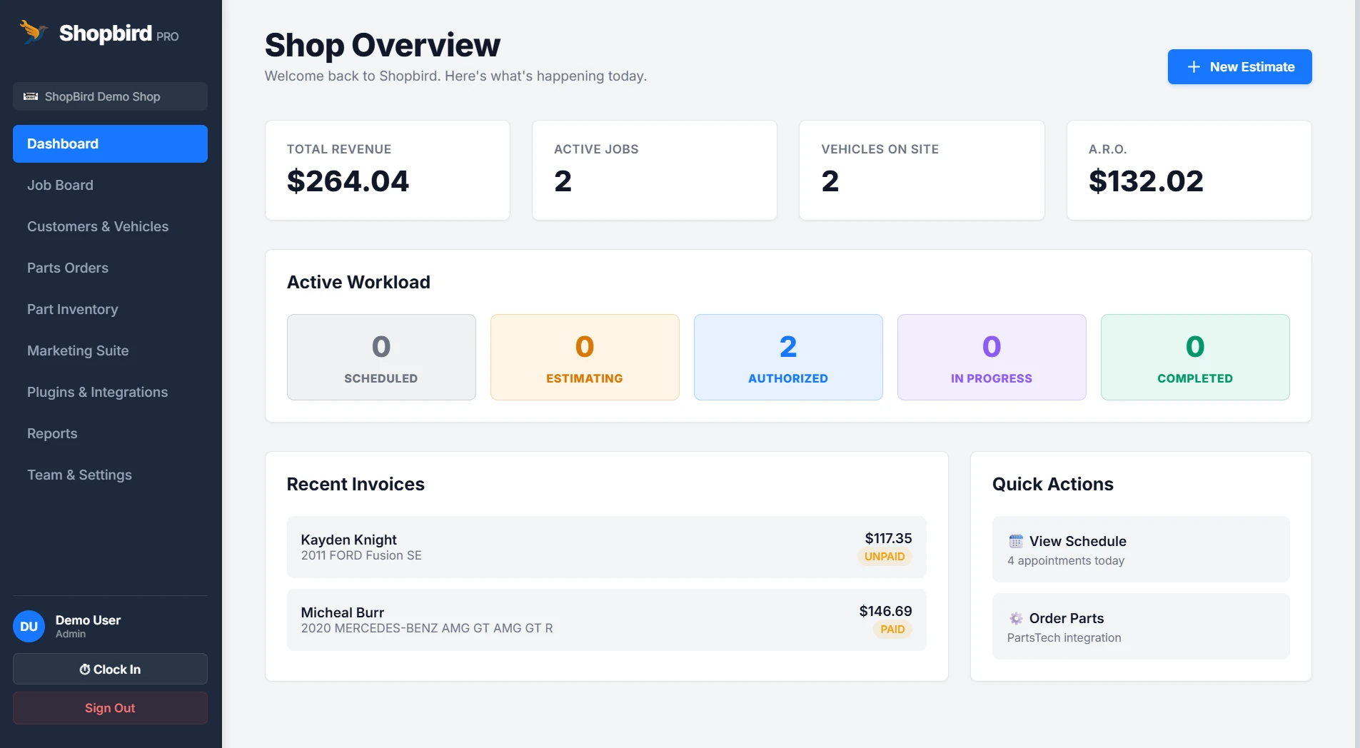
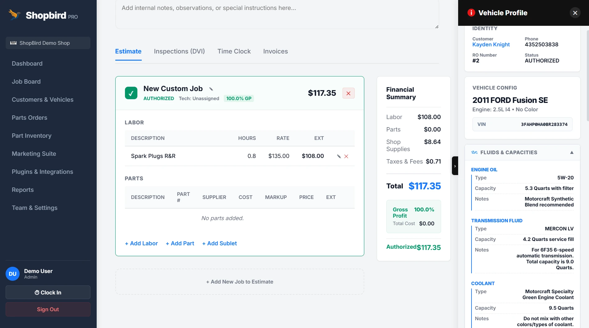
Color, with
purpose.
Exact values from the identity. Select a swatch to copy its HEX code. Pair color with readable labels and choose text colors with sufficient contrast.
Core
Chrome & navy
Status & charts
Every word,
considered.
A deliberate hierarchy, from the first headline to the smallest label. The specimens use each brand’s actual typefaces.
Your shop. In focus.
ABCDEFGHIJKLMNOPQRSTUVWXYZabcdefghijklmnopqrstuvwxyz · 0123456789
Inter
300–800
Your shop. In focus.
Micro-kicker
700 · 1.5–2px tracking
Developer First · Powered by Data
UI text
400–500
RO #4821 · 2019 Silverado · Brake service - in progress.
A system
in use.
Actions, labels, and surfaces working together. These are visual specimens of the interface language.
ShopBird / Interface study
Your shop. In focus.
Confident and specific. Use the language of the shop: repair orders, inspections, vehicles, and next steps.
Keep it
recognizable.
Confident and specific. Use the language of the shop: repair orders, inspections, vehicles, and next steps.
- 01
Separate brand and work surfaces
Use navy for navigation and brand presentation. Keep the working app light, flat, and easy to read.
- 02
Keep the two radius scales
Use 4px corners for landing-page actions and 8px for in-app controls. Keep labels short and action-oriented.
- 03
Preserve a useful visual language
Use the original wrench-winged bird and the flat product icon set. Reserve teal for brand accents and status colors for meaning.
Palette proportions follow the brand guide on Jarin.dev. Original marks and product artwork are checked against the project’s source assets; screenshots are dated where shown.
View original on jarin.dev ↗