SalesBird
Stylebook.
A field-sales identity built around movement and clarity. Rose accents, restrained blush surfaces, and a mobile-first interface keep territory, leads, and follow-ups connected.
 SaaS Product · Field Sales
A mark with
character.
Use the original artwork. Preserve its proportions, keep it clear of competing elements, and choose a background that gives it room to read.
Original artwork · supplied asset
Color, with
purpose.
Exact values from the identity. Select a swatch to copy its HEX code. Pair color with readable labels and choose text colors with sufficient contrast.
Primary rose
Field tints
Dark & maroon
Lead statuses
Every word,
considered.
A deliberate hierarchy, from the first headline to the smallest label. The specimens use each brand’s actual typefaces.
Your territory. Connected.
ABCDEFGHIJKLMNOPQRSTUVWXYZabcdefghijklmnopqrstuvwxyz · 0123456789
Inter
300–800
Your territory. Connected.
Micro-label
700 · 1.5px tracking
Field Sales, In Motion
Workflow numerals
800 · rose-400
01 Knock → 02 Log → 03 Follow → 04 Close
A system
in use.
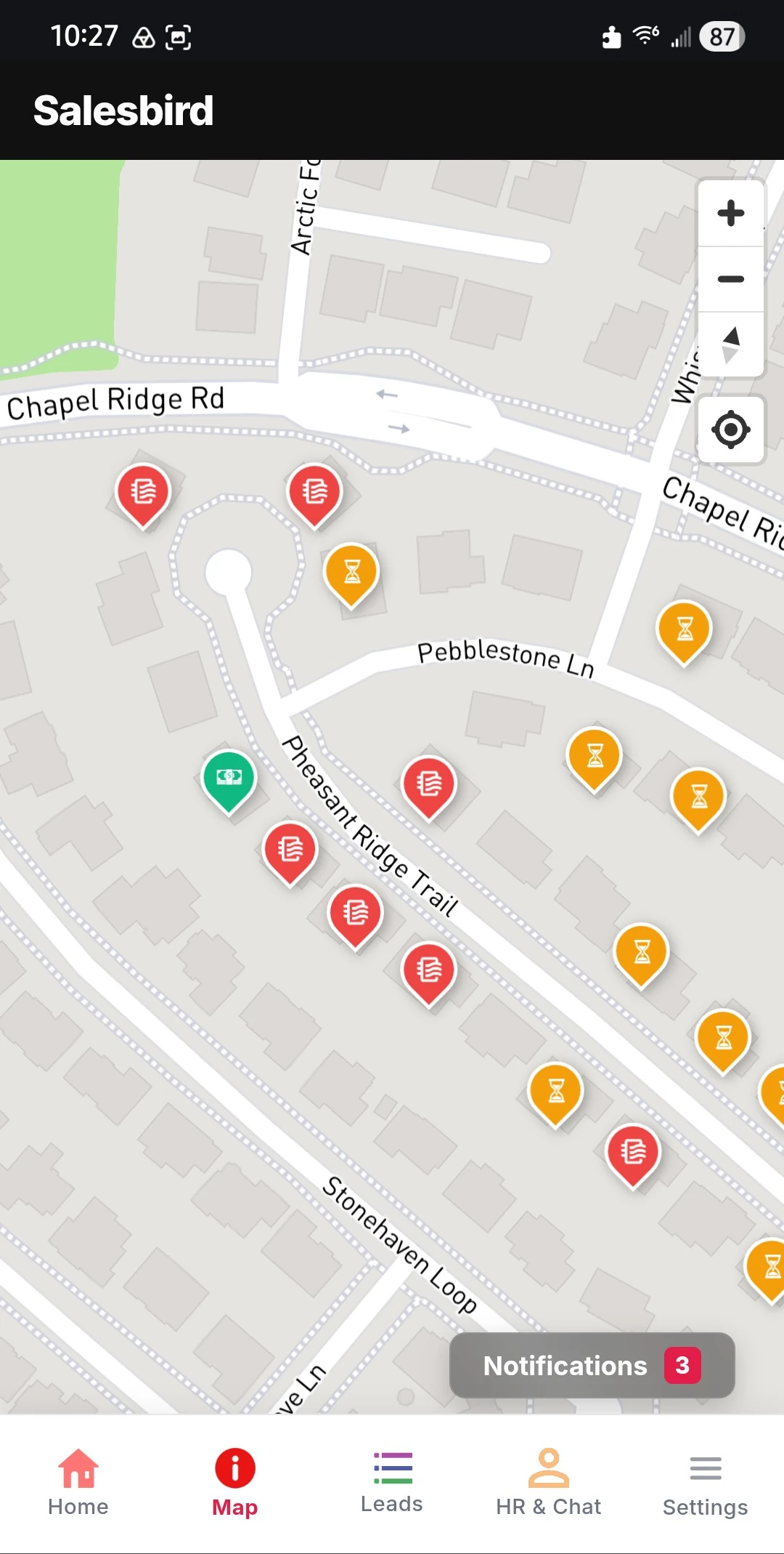
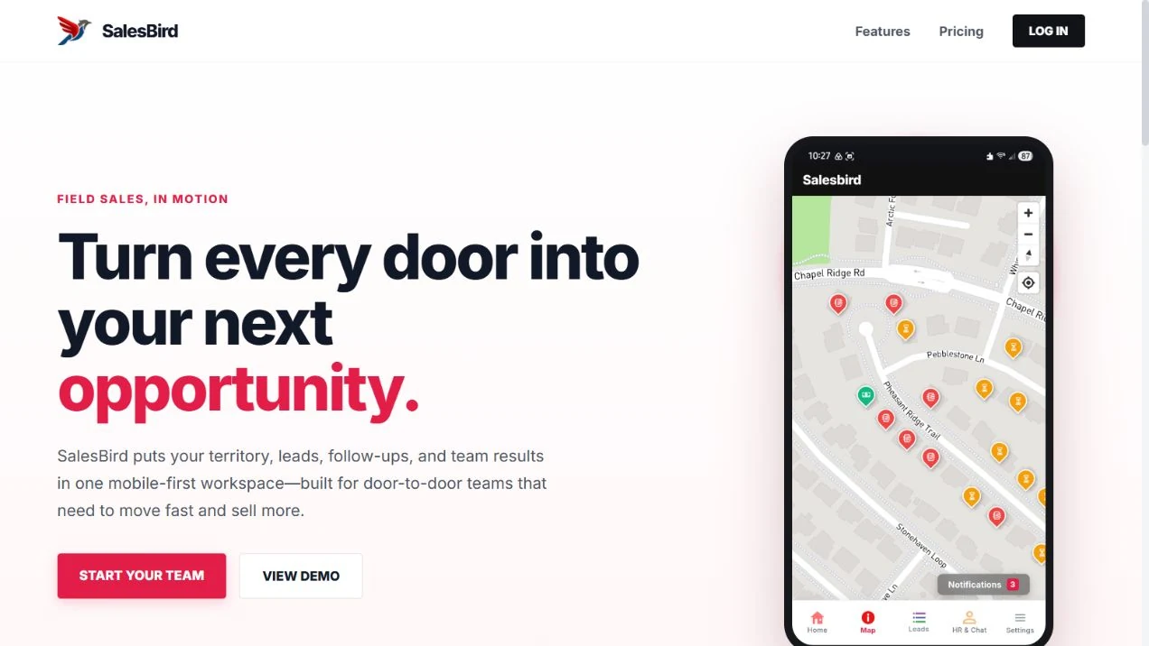
Actions, labels, and surfaces working together. These are visual specimens of the interface language.
SalesBird / Interface study
Your territory. Connected.
Energetic and concrete. Lead with the action a representative needs to take next.
Keep it
recognizable.
Energetic and concrete. Lead with the action a representative needs to take next.
- 01
Use the SalesBird identity
Use the current rose bird artwork. Keep the product distinct from ShopBird’s blue identity.
- 02
Keep lead statuses consistent
Status colors carry operational meaning. Pair every colored marker with a readable label; never rely on color alone.
- 03
Prioritize the phone in hand
Use large tap targets, clear next actions, and quiet white surfaces. Rose leads; blush stays in the background.
Palette proportions follow the brand guide on Jarin.dev. Original marks and product artwork are checked against the project’s source assets; screenshots are dated where shown.
View original on jarin.dev ↗