Northcurrent
Stylebook.
An apparel identity with a restrained editorial rhythm. Serif headlines, an understated gold accent, and neutral product photography give each collection space to speak.
 E-Commerce · Premium Apparel
A mark with
character.
Use the original artwork. Preserve its proportions, keep it clear of competing elements, and choose a background that gives it room to read.


Original artwork · supplied asset

Color, with
purpose.
Exact values from the identity. Select a swatch to copy its HEX code. Pair color with readable labels and choose text colors with sufficient contrast.
Old gold
Base
Signal
Every word,
considered.
A deliberate hierarchy, from the first headline to the smallest label. The specimens use each brand’s actual typefaces.
Move with the current.
ABCDEFGHIJKLMNOPQRSTUVWXYZabcdefghijklmnopqrstuvwxyz · 0123456789
Libre Baskerville
400 / 700 + italic
The Gen 1 Collection
Lato
300 / 400 / 700
Shop Staples - Explore Art
Gold eyebrow
Lato 700 · tracked
The Gen 1 Collection
A system
in use.
Actions, labels, and surfaces working together. These are visual specimens of the interface language.
Northcurrent / Interface study
Move with the current.
Measured, tactile, concise. Describe the garment and its character with specific language.
Keep it
recognizable.
Measured, tactile, concise. Describe the garment and its character with specific language.
- 01
Use gold with restraint
Reserve old gold for small accents, prices, and emphasis. Let white space and black typography carry most of the page.
- 02
Respect the two wordmarks
Use the supplied header wordmark, serif lockup, and N icon at their original proportions. Give each mark a calm, uncluttered setting.
- 03
Let the product carry the story
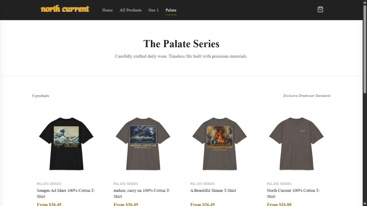
Keep garment photography neutral and consistent. The artwork supplies the nautical character; the interface supports it.
Palette proportions follow the brand guide on Jarin.dev. Original marks and product artwork are checked against the project’s source assets; screenshots are dated where shown.
View original on jarin.dev ↗