DC Sys Tech
Stylebook.
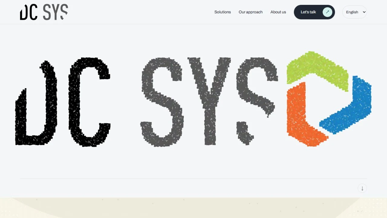
A bilingual identity for an Ecuadorian technology company. A distinctive three-color mark brings software, web, infrastructure, and technical services into one coherent system.
 Client · Quito, Ecuador
A mark with
character.
Use the original artwork. Preserve its proportions, keep it clear of competing elements, and choose a background that gives it room to read.


Original artwork · supplied asset

Color, with
purpose.
Exact values from the identity. Select a swatch to copy its HEX code. Pair color with readable labels and choose text colors with sufficient contrast.
Ribbons - from the mark
Base
Surfaces & materials
Every word,
considered.
A deliberate hierarchy, from the first headline to the smallest label. The specimens use each brand’s actual typefaces.
Developing your dreams.
ABCDEFGHIJKLMNOPQRSTUVWXYZabcdefghijklmnopqrstuvwxyz · 0123456789
Archivo
400
Developing your dreams.
Space Mono
400
Software · Web · Infra · Tech
A system
in use.
Actions, labels, and surfaces working together. These are visual specimens of the interface language.
DC Sys Tech / Interface study
Developing your dreams.
Clear, capable, welcoming. Explain the solution in everyday language, with equal care in English and Spanish.
Keep it
recognizable.
Clear, capable, welcoming. Explain the solution in everyday language, with equal care in English and Spanish.
- 01
Honor the original mark
Use the supplied vector artwork. Preserve the green, orange, and blue ribbons, their order, and their proportions.
- 02
Let the work lead
Keep everyday pages on quiet paper surfaces. Reserve the dimensional logo and orange curtain for key brand moments.
- 03
Design in two languages
Give English and Spanish the same hierarchy, space, and clarity. Check both versions at every screen size.
Palette proportions follow the brand guide on Jarin.dev. Original marks and product artwork are checked against the project’s source assets; screenshots are dated where shown.
View original on jarin.dev ↗